The internet is constantly evolving, and with that, so is the eCommerce sector. What worked well in 2021 may not be as effective this year, and what is popular now could be completely different in a few months. As a business owner, it’s essential to stay ahead of the curve and keep your eCommerce store looking fresh. Because it only takes 0.5 seconds to make a first impression. Therefore, your store’s design must be visually appealing and engaging at any cost.
Today, there are around 24 million eCommerce sites around the world. No doubt, it’s a competitive landscape, and standing out from the crowd is essential. So, it’s vital to stay on top of the latest eCommerce design trends and find ways to incorporate them into your store. Any slight change can make a big difference in how your customers perceive your brand.
Top eCommerce Design Trends for 2022:
In this blog, we will take a look at some of the most popular eCommerce design trends for 2022. Keep these in mind when you are planning your next redesign or revamp. Let’s start.
1) Cinemagraphs: A Still Image With Moving Parts
Cinemagraphs are still images that have moving parts. They can be used to create engaging and eye-catching visuals that can help capture your audience’s attention. These images are becoming increasingly popular on social media, as they are a great way to stand out in a sea of static images. You can use cinema graphs in many ways on your eCommerce site.
For example, you can use them as banner images or product photos. Or, you could create an animated header that features a moving image. Top websites like Amazon and Nike already use cinema graphs on their sites, a great eCommerce design trend to follow.
2) Micro-interactions: Animations That Help Guide Users
Micro-interactions are animations that help guide users through your site or application. They can explain how something works or show the user that their action has been successful.
These animations can help to create a more engaging and user-friendly experience. They can be used in many ways, such as providing feedback, progress indicators, or error messages. You are probably already using micro-interactions on your site without even realizing it.
For example, the “loading” animation that appears when a page is loading is a micro-interaction. It’s a small detail, but it can help to improve the user experience.
3) Chatbots: Automated Conversations With Customers
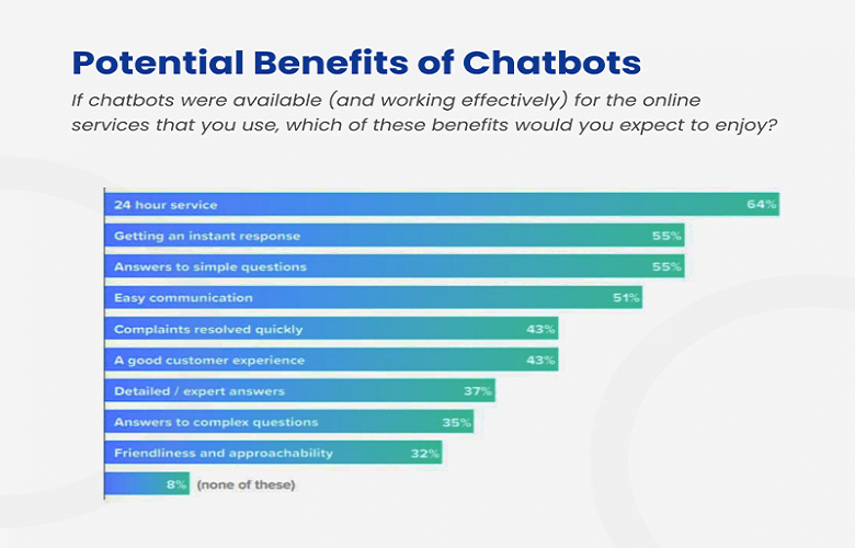
Chatbots are AI-powered programs that simulate human conversation. They can answer questions, provide customer support, or promote products and services.
As technology improves, chatbots are becoming more and more realistic. They can hold natural conversations with customers and provide a more personal experience.
Many businesses are using chatbots on their eCommerce sites. In fact, it’s estimated that chatbots will handle 85% of customer interactions in 2022.
Sephora is the best example here. It uses chatbots to help customers find the right product for their needs. Customers can ask the chatbot questions about products, makeup trends, and more.
4) Customizable Design: Letting Customers Choose Their Own Experience
Customizable eCommerce design trend is gaining popularity in the eCommerce world. It allows customers to choose their own experience and create a unique shopping journey.
This type of design can provide a more personal experience for customers and can help to increase customer loyalty. It also aids in building a connection with the customer and makes them feel like part of the process.
Many stores use customizable eCommerce design trends, including Amazon, Nike, and Asos.
- Amazon lets customers choose their product colors and fonts.
- Nike allows customers to create their sneakers.
- Asos lets its customers select the layout of their pages and even the color of their buttons.
5) Augmented Reality: Bringing Products to Life
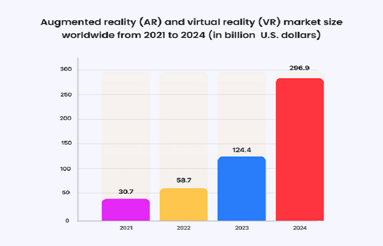
Augmented reality allows you to superimpose computer-generated images on top of real-world objects. It can create interactive experiences that bring products to life. This technology is becoming popular, and it’s estimated that by 2022, over half of all eCommerce transactions will involve AR.
Some businesses are already using AR on their sites; their name includes:
- IKEA has an app that allows customers to see how furniture will look in their home before they buy it.
- Sephora has an app that lets its customers try makeup before purchasing it.
Therefore, the uses for AR are endless, and businesses would be wise to add this eCommerce design trend to their site.
6) Bold Typography: Making a Statement With Words
Bold typography is an eCommerce design trend that is all about making a statement with words. It’s about using large, bold fonts to grab attention and make an impact.
Ecommerce stores are using bold typography to create an eye-catching and engaging experience. It highlights essential information or adds personality to a site.
For example, Warby Parker, Everlane, and Bonobos are already using bold typography on their sites.
- Warby Parker uses large, bold fonts to highlight important information on its homepage.
- Everlane uses bold typography to add personality to its product pages.
- Bonobos use bold typography to create an impactful and engaging experience.
7) Orignal Photographs: Showcasing Products in a New Way
Original photographs are a trend that is all about displaying products in a new way. It’s about using creative and unique images to capture attention and stand out from the competition.
Many eCommerce developers are using original photographs to display their products. For example, ModCloth uses original pictures to show off its clothing creatively and uniquely.
Everlane also uses original photographs to show its products in use. It helps customers see how the products look in real life and makes them more likely to purchase them.
8) Neutral/Pastel Colors: Creating a Relaxing Shopping Experience
Neutral/pastel colors are a trend that is all about creating a relaxing shopping experience. It’s about using soft, calming colors to create an inviting and relaxed atmosphere.
The eCommerce design trend is becoming popular as it can help to increase sales and conversion rates. Studies have also shown that colors can significantly impact customer behavior. Neutral/pastel colors often create an inviting and relaxing atmosphere.
For example, Lululemon uses soft, calming colors on its website to create a comfortable shopping experience. Aritzia also uses neutral/pastel colors to create a relaxing atmosphere. Its website is filled with soft, calming shades of blue and green.
9) Easy Navigation: Helping Customers Find What They Need
Easy navigation is also a popular eCommerce design trend that is all about helping customers find what they need. It’s about using clear and concise menus to help customers navigate your site quickly and easily.
This is a must-have thing for any eCommerce store as it can help increase sales and conversion rates. Studies have shown that easy navigation is one of the most important factors for website usability.
Many eCommerce stores use easy navigation to make it easier for customers to find what they need. For example, Amazon uses clear and concise menus to help customers navigate its vast selection of products.
Zappos also uses easy navigation to help customers find what they need. Its simple and concise menu makes it easy for customers to find their products easily.
10) Vaporwave Aesthetics: Creating a Unique and Eye-catching Look
Vaporwave aesthetics is a trend that is all about creating a unique and eye-catching look. It’s about using retro, 80s-inspired designs to create an eye-catching and memorable experience.
These aesthetics are becoming popular with eCommerce stores as they can help to increase sales and conversion rates. Studies have also shown that they can significantly impact customer behavior.
The best example of a store using vaporwave aesthetics is probably Vinted. The site uses retro, 80s-inspired designs to create a unique and eye-catching look. Another one is ASOS. The store also uses vaporwave aesthetics to create a memorable and engaging experience.
11) Mobile-First Approach: Optimizing Sites for Mobile Devices
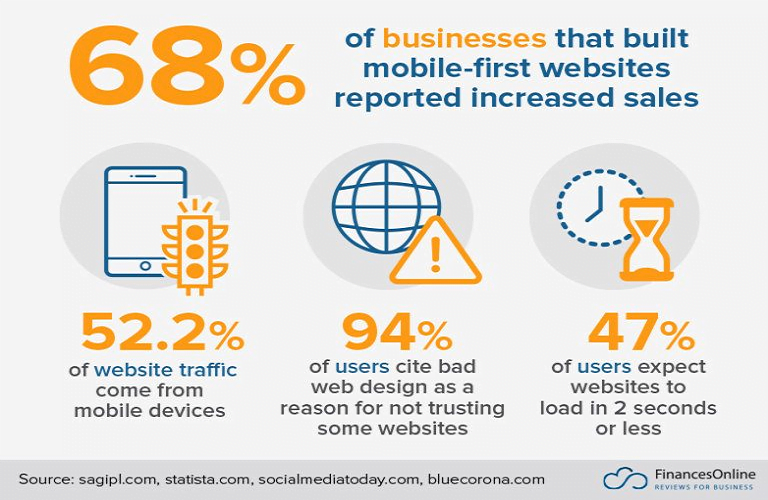
A mobile-first approach is a trend that is all about optimizing sites for mobile devices. It’s about using responsive design to make your site look great on any device.
According to OuterBox’s study, 79% of smartphone users purchased online using their mobile devices in 2021. This count will only increase in the coming years as more and more people use their smartphones for everything.
We should also note that Google is now using a mobile-first index, which means that your site’s mobile version will be the one used to rank your pages in the search results. So, if you don’t have a mobile-friendly site, you’re going to lose out on a lot of traffic and potential customers.
12) Storytelling Approach: Creating an Emotional Connection
The next trend on our list is the storytelling approach. It is all about creating an emotional connection with your customers. It’s about using stories to connect with customers more profound and make them more likely to purchase from you.
It is a powerful eCommerce design trend that can help to increase sales and conversion rates. Studies have shown that storytelling is one of the most effective ways to connect with customers more profoundly.
Many eCommerce stores use the storytelling approach to create an emotional connection with their customers. One great example is Patagonia.
The store uses stories to connect with customers deeper and make them more likely to purchase. Another example is Warby Parker. The store also uses stories to create an emotional connection with customers.
13) Videos: Use Videos To Promote Products and Services
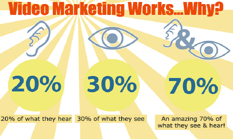
Video is becoming an increasingly important marketing tool. In fact, Cisco predicts that video will account for 80% of all internet traffic. It is because videos are a great way to promote products and services.
They can help explain things in a more engaging and visually appealing way. And they can help to increase sales and conversion rates.
Adding videos to your eCommerce store is a great way to take advantage of this trend. Many stores are using videos to promote their products and services.
One great example is ZenDesk. The store uses videos to explain how its products work and to promote them. Another one is Apple. The store uses videos to promote its products, services, and brand.
14) New Experiment: Always Try New Things
The final trend on our list is to try new things. It is about experimenting with new marketing strategies and tactics to see what works best for your eCommerce store.
It’s a trend about being proactive and trying new things. It’s about being willing to experiment and see what works best for you.
Many eCommerce stores are using this trend to increase sales and conversion rates. One great example is Amazon. The store is constantly experimenting with new strategies and tactics to find what works best.
So, if you want to succeed in eCommerce, you need to be willing to experiment with new things. Try out new marketing strategies and tactics and see what works best for you.
Conclusion:
As you can see, there are a lot of excellent eCommerce design trends for 2022 that you can use to captivate your audience. These trends will help you create a more user-friendly and engaging experience for your customers.
So, if you are looking to increase sales and conversion rates, make sure to use these trends. You can also reach out to an eCommerce development company for better guidance. They will help you create a stunning and successful online store.


